The Power of Pairing: How to Combine Complementary Typefaces for Effective Design
Typography plays a pivotal role in design, and the careful selection and combination of typefaces can significantly impact the visual appeal and overall effectiveness of a design project. One of the key aspects of typography is the art of pairing complementary typefaces. When done correctly, pairing typefaces can create harmony, establish hierarchy, and evoke specific emotions within a design. In this article, we will explore the power of pairing and provide practical tips on how to combine complementary typefaces for effective design.
Understanding Complementary Typefaces
Complementary typefaces are fonts that harmonize and balance each other when used together in a design. These typefaces are distinct from each other in terms of style, structure, or characteristics, yet they share a visual compatibility that creates a compelling contrast. The successful pairing of complementary typefaces requires a keen eye for aesthetics and an understanding of the principles of typography.
Here’s a step-by-step guide to help you master the art of combining complementary typefaces:
Define the Purpose and Mood of Your Design
Before choosing typefaces, it’s crucial to define the purpose and mood of your design. Consider the message you want to convey and the emotions you want to evoke. Is it a formal business website, a whimsical children’s book, or a sleek fashion magazine? Understanding the context will guide your typeface selection and ensure that the pairing aligns with the overall design concept.
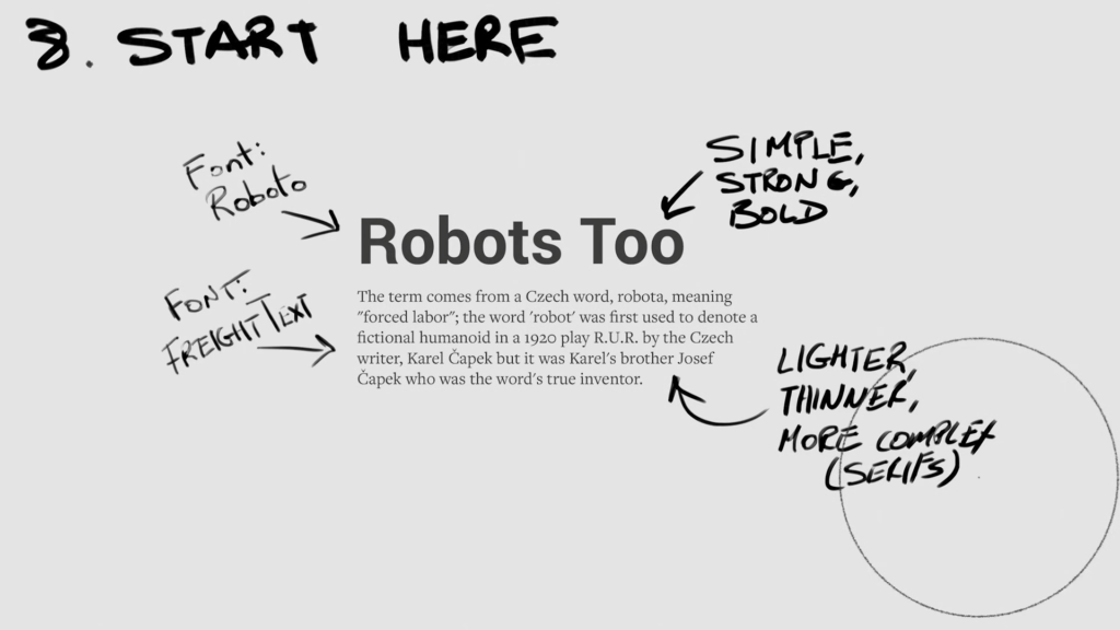
Establish Hierarchy
Pairing typefaces can help establish a clear hierarchy within your design. Begin by identifying the key elements that require emphasis, such as headlines, subheadings, and body text. Select a primary typeface that captures the essence of your design and conveys the main message. This typeface will often be used for headlines or prominent sections. Then, choose a secondary typeface that complements the primary one and is used for supporting text or subheadings. The secondary typeface should offer enough contrast to create a visual hierarchy while maintaining a cohesive look.
Contrast the Typefaces
To achieve a visually appealing pairing, aim for contrast between the chosen typefaces. This can be achieved through differences in weight, style, or structure. For instance, pair a serif typeface with a sans-serif typeface to create a contrast between traditional and modern aesthetics. Alternatively, combine a condensed typeface with a more spacious and open typeface to create a contrast in proportions. The key is to strike a balance that adds visual interest without creating a jarring effect.
Consider Visual Harmony
While contrast is important, it’s equally crucial to ensure visual harmony between the typefaces. Look for shared attributes that create a sense of cohesion. This could be similarities in letterforms, x-heights, or overall proportions. The typefaces should feel like they belong together, even with their contrasting elements. Experiment with different combinations and consider how they interact with other design elements to achieve the desired visual harmony.
Test for Readability and Legibility
Regardless of the pairing, readability and legibility should never be compromised. Ensure that the selected typefaces are easy to read across different sizes and screen resolutions. Pay attention to factors such as spacing, line height, and letterforms’ clarity. Test the pairing in various contexts, including different devices and screen sizes, to confirm that the text remains clear and legible.
Limit the Number of Typefaces
While it can be tempting to explore multiple typeface combinations, it’s generally recommended to limit the number of typefaces in a design. Using too many typefaces can create visual clutter and dilute the impact of each typeface. As a general guideline, stick to two or three typefaces that complement each other. If additional variation is needed, rely on different weights or styles within the chosen typefaces.
Seek Inspiration and Learn from Examples
Typography is an art form, and learning from established designs can help refine your pairing skills. Explore typography showcases, design blogs, and professional portfolios to discover inspiring examples of complementary typeface combinations. Analyze how designers have successfully integrated different typefaces and consider how you can adapt those principles to your own projects. This research will expand your typographic knowledge and inspire new ideas.
Trust Your Eye and Iterate
While there are guidelines and best practices, typography is ultimately a subjective field. Trust your eye and intuition when selecting and combining typefaces. Experiment, iterate, and seek feedback from others to refine your pairings. Sometimes, minor adjustments can make a significant difference in the overall impact of your design. With practice and experience, you’ll develop an instinct for successful typeface pairings.
The power of pairing complementary typefaces is undeniable in creating effective and visually appealing designs. By understanding the purpose of your design, establishing hierarchy, contrasting the typefaces, achieving visual harmony, and prioritizing readability, you can master the art of combining typefaces. Remember to limit the number of typefaces, seek inspiration from existing designs, and trust your eye during the iteration process. With these tips in mind, you’ll be well-equipped to create stunning designs that leverage the power of typeface pairing.