Scale and Proportions in Design: How to Create Balance with Typography and Typeface
In the realm of design, scale and proportions play a vital role in creating visually appealing and balanced compositions. When it comes to typography and typeface, understanding how to effectively use scale and proportions can greatly enhance the overall impact and readability of your design. In this article, we will explore various techniques and principles that will help you create balance and harmony in your designs through the thoughtful application of scale and proportions.
Establish a Visual Hierarchy
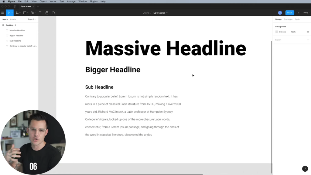
One of the key aspects of using scale and proportions in design is establishing a clear visual hierarchy. By assigning different scales to different elements, you can guide the viewer’s attention and create a sense of order. Start by determining the primary focal point of your design, such as the headline or the most important message. Use a larger scale for this element to make it stand out. Then, gradually decrease the scale for secondary elements, such as subheadings and body text. This progression in scale ensures that each element has its proper place in the hierarchy, leading to a more organized and balanced design.
Consider the Content and Context
When choosing the scale and proportions for typography and typeface, it’s essential to consider the content and context of your design. Different types of content may require different scales to effectively convey their message. For example, a bold and impactful headline may benefit from a larger scale, while a more subtle and informative paragraph may require a smaller scale. Similarly, the context in which your design will be displayed should influence your decision. Consider the medium, such as print or digital, as well as the physical space available for your design. Adapting the scale and proportions to fit the context ensures that your typography seamlessly integrates with the overall design.
Embrace Contrast
Contrast is a powerful tool when it comes to scale and proportions in design. By incorporating contrast in your typography and typeface, you can create visual interest and draw attention to specific elements. Experiment with contrasting scales by juxtaposing large and small typefaces or mixing bold and regular variations within a typeface family. This contrast creates a dynamic visual experience and adds depth to your design. However, be mindful of achieving balance and harmony. Too much contrast can lead to a chaotic and disorganized design, while too little can result in a monotonous and uninteresting composition.
Utilize Negative Space
Negative space, also known as whitespace, is an integral part of scale and proportions in design. It refers to the empty space surrounding your typography and typeface. Embracing negative space provides breathing room for your text, enhances legibility, and contributes to a balanced composition. Consider the amount of negative space around your typography and typeface to create a harmonious relationship between the text and the surrounding elements. Proper spacing ensures that your typography is neither cramped nor isolated, creating a visually pleasing and comfortable reading experience.
Test and Refine
As with any design process, testing and refinement are essential when working with scale and proportions. Take the time to step back and evaluate your design from a distance. Assess the overall balance and harmony of the composition. Pay attention to the relationships between different elements and make adjustments as needed. Experiment with different scales and proportions to find the optimal arrangement that best communicates your intended message. Solicit feedback from colleagues or users to gain valuable insights and perspectives. Iteration and refinement are key to achieving the perfect balance in your design.
Maintain Consistency
Consistency is a crucial aspect of scale and proportions in design. Once you establish a scale and proportion system for your typography and typeface, ensure that it remains consistent throughout your design. Consistency creates a sense of coherence and professionalism. Stick to the established scales for different elements, such as headings, subheadings, and body text, to maintain a cohesive visual identity. Deviating from the established scales can disrupt the balance and confuse the viewer. Regularly review your design to ensure that the scales and proportions are consistently applied.
Experiment with Typography and Typeface Pairings
The choice of typography and typeface can significantly impact the scale and proportions in your design. Experiment with different typefaces and explore their inherent scales and proportions. Some typefaces naturally have a larger x-height or wider letterforms, while others are more compact and condensed. Consider the character of the typeface and how it complements or contrasts with other design elements. Pair different typefaces to create a harmonious relationship between scales and proportions. Combining a large-scale headline typeface with a smaller-scale body text typeface can create an interesting and balanced composition.
Seek Inspiration and Learn from Others
Design is a collaborative and ever-evolving field. Seek inspiration from other designers and learn from their approaches to scale and proportions in typography and typeface. Explore design resources, books, and online platforms to discover innovative and effective techniques. Analyze and deconstruct designs that resonate with you, paying close attention to how scale and proportions are utilized to create balance. By continuously seeking inspiration and learning from others, you can expand your design repertoire and refine your skills in scale and proportions.
Scale and proportions are vital elements in creating balanced and visually appealing designs. When applied thoughtfully to typography and typeface, they enhance the hierarchy, readability, and overall impact of your design. By establishing a visual hierarchy, considering the content and context, embracing contrast, utilizing negative space, testing and refining, maintaining consistency, experimenting with typography and typeface pairings, and seeking inspiration from others, you can master the art of scale and proportions in design. Embrace the power of scale and proportions to create captivating and harmonious compositions that engage and delight your audience.