Mastering Typography: Experiment and Iterate for Stunning Designs with Typefaces
Typography is an art form that transcends mere words on a page; it has the power to evoke emotions, set the tone, and enhance the overall aesthetics of any design. Whether it’s for a website, poster, logo, or book cover, mastering typography is essential for designers seeking to create stunning and impactful visual experiences. Among the many keys to mastering typography, one that stands out is the art of experimenting and iterating with typefaces. In this article, we’ll delve into the importance of experimentation and iteration in typography and how it can elevate your design projects to new heights.
Understanding the Essence of Typography
Before we dive into the world of experimentation and iteration, it’s crucial to understand the essence of typography. Typography involves the thoughtful selection and arrangement of typefaces to effectively communicate a message, evoke emotions, and establish visual harmony. Each typeface has its unique personality and voice, ranging from the elegant serifs to the clean and modern sans-serifs, and the playful scripts to the bold display typefaces.
Experimentation: Unleashing Creativity and Possibilities
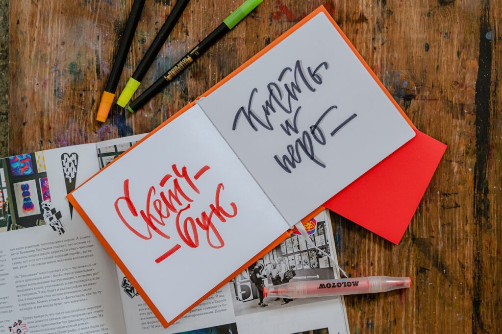
Experimentation is the cornerstone of creativity in design. By exploring various typefaces, layouts, and compositions, designers open themselves up to endless possibilities. Experimenting with different typefaces allows you to discover unexpected pairings, uncover hidden synergies, and explore new visual dimensions. Don’t be afraid to step outside the comfort zone of familiar typefaces; instead, let curiosity and creativity guide you on a journey of exploration.
Try combining serifs with sans-serifs, mixing different styles, or even customizing typefaces to suit your design vision. As you experiment, take note of the emotions and impressions each combination evokes. Observe how each typeface interacts with others and the overall impact it has on the design. Keep a record of your experiments, as these insights will prove valuable in later stages of the design process.
Iteration: Refining and Enhancing the Design
The magic of iteration lies in refinement. Once you have experimented with various typefaces and combinations, the iterative process involves analyzing, refining, and improving your design based on the insights gained during experimentation. This is where your critical eye comes into play. Evaluate the visual hierarchy, balance, and readability of the typography.
Look for opportunities to enhance the design by making subtle adjustments to kerning (letter spacing), leading (line spacing), and tracking (letter spacing across an entire word or sentence). Pay attention to the proportions and alignment of the typefaces in relation to other design elements. By iterating and fine-tuning your design, you will create a more polished and professional outcome.
Consistency and Cohesion
While experimentation and iteration encourage creative exploration, it’s crucial to maintain consistency and cohesion in your typography. A design with inconsistent typefaces can result in visual chaos and confuse the audience. Instead, seek to establish a cohesive visual identity that reflects the essence of the message or brand.
Once you have identified typefaces that work well together, apply them consistently across various design elements, such as headings, body text, captions, and call-to-action buttons. Consistency in typography will create a sense of unity and make your design visually appealing and easy to comprehend.
Typography and Branding
In the world of branding, typography plays a central role in communicating a brand’s personality and values. Experimentation and iteration become invaluable tools in finding the perfect typefaces that align with the brand’s identity. Take the time to explore typefaces that reflect the brand’s character – whether it’s modern and innovative, traditional and trustworthy, or playful and energetic.
Experiment with various typefaces and combinations to see which ones best resonate with the brand’s mission and target audience. Once you have narrowed down your choices, iterate to fine-tune the typography and ensure a consistent visual identity across all brand touchpoints.
Effective Hierarchy and Readability
Hierarchy and readability are paramount in typography, especially when conveying information or guiding the audience through content. Experiment with typeface variations, sizes, and styles to establish a clear hierarchy in your design. Use bold or italic variations for headings and subheadings to create emphasis, while employing regular or light variations for body text to maintain readability.
Take into account line length and line spacing to avoid overwhelming the reader with densely packed text. Ensure that the typography is legible at various screen sizes and devices, paying attention to the balance between readability and visual aesthetics.
Embracing Negative Space
In typography, negative space (also known as whitespace) is equally as important as the typefaces themselves. Experiment with incorporating ample negative space around your typefaces to allow them to breathe and stand out. Whitespace adds a sense of elegance and sophistication to your design while creating visual balance and enhancing readability.
Through iteration, fine-tune the spacing and layout to achieve the perfect balance between positive elements (typefaces) and negative space. Embracing negative space allows the typography to shine and gives your design a clean and uncluttered appearance.
Balancing Trends and Timelessness
Experimenting with contemporary typographic trends can be exhilarating, as it allows you to infuse your design with fresh and modern aesthetics. However, it’s essential to balance trendy elements with timeless design principles. Trends come and go, but timeless typography endures.
Be mindful of the longevity of your design by selecting typefaces that remain relevant beyond the current trend. Through iteration, seek to find the balance between trendy and timeless elements in your typography to ensure a design that stands the test of time.
Learning from Feedback and Critique
Throughout the process of experimentation and iteration, seek feedback and critique from peers, colleagues, or even the target audience. Constructive feedback provides valuable insights that can help you identify areas of improvement and refine your design further.
Be open to feedback and willing to make necessary adjustments based on the feedback received. Remember that the goal is not perfection but progress. Embrace the learning opportunities that come from the feedback process, and use it to strengthen your typographic skills.
Typography is a dynamic and powerful tool in the hands of a skilled designer. By embracing experimentation and iteration, designers can unlock new creative possibilities and discover unique typeface combinations that elevate their designs to new heights. Experimentation allows for the exploration of different typefaces, while iteration refines and enhances the design. By maintaining consistency, prioritizing hierarchy and readability, embracing negative space, and balancing trends with timelessness, designers can master typography and create stunning designs that leave a lasting impression on their audience. As the world of typography continues to evolve, remember that experimentation and iteration will always be key to unleashing the full potential of this art form. So, venture forth fearlessly, let creativity guide you, and discover the beauty of typography in all its glory.